guia gali
WOW Business
Interface Design ∙ Experience Design

Challenge
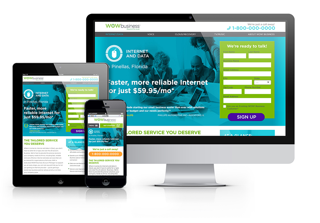
Design a geo-marketing microsite that converts visitors through phone calls and formfills. The design should enable high conversions while capturing the essence of brand's current identity.
Solution
This is the first piece to our Performance Creative series. The form takes prominence in desktop and tablet where there is ample space. In mobile, the form is hidden and the phone number is promoted above the fold within thumb's reach. I took inspiration from the company's collateral and examined competitor's sites for the look & feel. I extended their color palette application to distinguish each service within the microsite.


Next Up: Responsive Microsites
View Case Study